Clarity attracts commitment.
Clarity attracts commitment.
Partner
Creating commitment through clarity: A case study on updating the Partner page on Visual Arena’s existing website.
Partner project
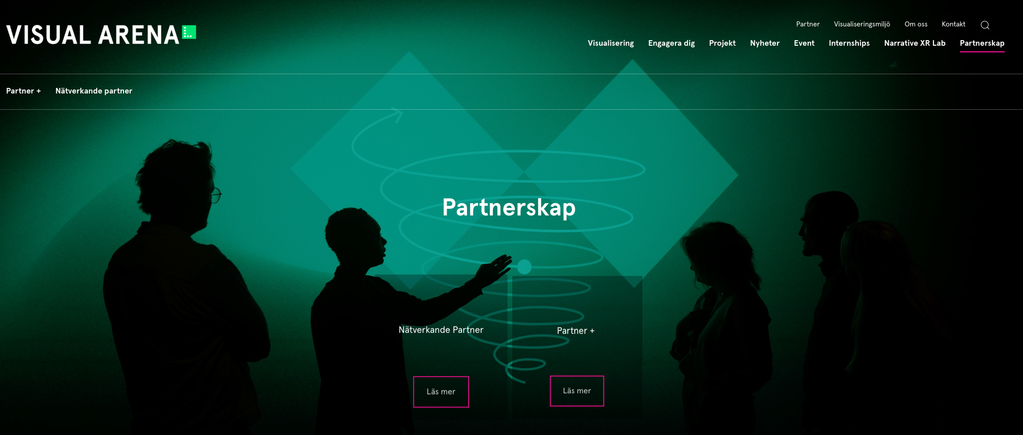
I had the honour of supporting Visual Arena at Lindhomen Science park with their partner page redesign. I collaborated with a classmate to clearly showcase Visual Arena’s offerings and help them attract new partners. The updated design, perceived by testers as dynamic, clear and informative, aimed to secure at least five Partner+ package purchases within six months. To support this, I created social media content and a press release to introduce the new packages to potential partners.
My role - Ux Designer
Team - Project manager, communications manager, production project manager, 2 visual designers, 2 Ux designers.
Duration - 3 Months ( April - June 2024)
Tools - Ux Research, UI Design, Figjam, ClickUp, Canva, Slack, NEXT, ChatGPT, Storyboarding.
Client - This project was done in Collaboration with and on behalf of Visual Arena of Lindholmen Science Park.
Snapshots of the final design.
You can check out the updataed Partner page here.
The beauty of internships.
Learning by doing.
This design internship was a valuable opportunity to quickly learn and utilize professional tools while delivering results. During my studies, Figma was my primary design tool, but Visual Arena used Drupal, a CMS. Although Drupal's design options were limited, I creatively leveraged it to produce appealing solutions.
The team communicated through regular Monday meetings and used ClickUp for task management. Since ClickUp wasn't ideal for storing creative work or brainstorming, FigJam was used for co-creation, while tasks and lists were managed in ClickUp to keep everyone updated on the process.
Collaboration, makes it happen!
Trusting in the team
During my internship, I collaborated closely with the project manager and communications manager, who served as my mentors. They outlined Visual Arena’s goals and constraints as a government-funded agency.
We brainstormed and sketched ideas for the new page structure based on prior research. These ideas were pitched to the team for feedback and feasibility checks. Through numerous meetings, presentations, and feedback sessions with our multidisciplinary team, we successfully brought our concepts to life.
Knowing, is half the battle.
Brainstorming content
With the page structure in place, we hosted a workshop with Visual Arena’s leadership to decide on specific content. We also interviewed past partners to understand their needs and expectations. Our goal was to create a comprehensive solution that reflected both Visual Arena's objectives and their users' needs, ensuring a clear description that would attract similar groups in the future.
Uncovering hidden gems.
From data to actionable insights
Collecting data is one thing; turning it into actionable insights is another. After our workshop, we had a wealth of information to process. I created a survey to summarize and present the ideas to the team, helping us decide which ideas to pursue. We discovered that our findings could improve not just the new partner page, but also the contact and about us pages, providing clearer information about Visual Arena's services.
Bringing it all together.
Perfecting the prototype
The page structure and content were combined using Visual Arena’s tools and design principles, such as hierarchy, balance, use of space, and repetition, to create the final design, which we refined based on feedback.
Building on a project initiated in January, we enhanced the initial Figma design for Drupal. We performed competitive analyses and conducted interviews to understand what partners valued, defining a previously undefined service.
To encourage exploration of Visual Arena’s offerings, we included testimonials on the website and gathered quotes for the social media campaign. Due to the production team’s busy schedule, some visual elements, like the video, were tested conceptually. We interviewed and tested with 16 stakeholders, both in person and digitally, to gather feedback and drive innovation, ensuring a clear and effective design.
Beyond expectations.
Expanding through exploration.
What started as an effort to improve one page led to the creation of five new innovative and informative pages.
We created:
A landing page.
Two pages describing different partner types (Networking and Partner+).
Two different signup forms for these partner types.
.
A peek into the social media campaign
As of the time I am writing this case study, these posts have not yet been used on Visual Arena's social media.
Learning to fly.
What this project taught me:
Dare to disrupt - The platform originally had a uniform style, causing all pages to look the same. To make the partner page stand out, I redesigned the buttons, changing them from solid bright pink with white text to outlined pink with white text. This adjustment gave the design a more modern and spacious feel. The change was well-received, with positive feedback from users and Visual Arena leadership, who were particularly impressed and pleased with the updated look.
SUS has her limitations - Using the System Usability Scale (SUS) isn’t always relevant. We wanted a concrete number to show our work's success, but the SUS questions didn’t fit our needs. Simple observation through moderated usability testing would have been more effective.
Reduce decision Fatigue - Sorting through 118 descriptive words for a website can be overwhelming. To reduce decision fatigue, it's helpful to limit the number of choices. Allowing testers to use their own words is another option, but it may result in less consistency.
Adapting takes time: Adjusting to a new team and their workflow is an important aspect of internships. Establishing balance through clear communication helps alleviate the pressure of completing tasks, learning new tools, and building relationships with new colleagues.


