Karla-Community
Creating community through design: A case study on implementing an activities feature in Karlatornet's existing app
We all crave connection.
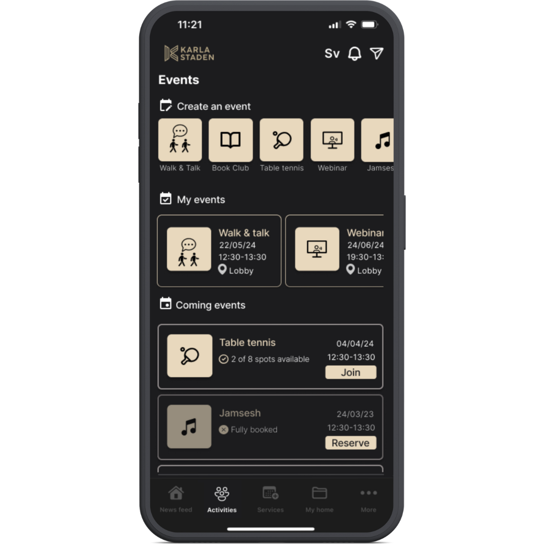
This project explores human connection, aiming to address the loneliness epidemic. It serves as my thesis for my UX design course, created in partnership with a classmate. Our initiative involved adding an activities feature to an existing app for a city skyscraper. Users found it easy to use and that it encouraged collaboration. It earned an impressive SUS score of 85.
My role - Ux Designer
Duration - 3 Months ( January - March 2024)
Tools - Figma, Figjam, Canva, Ux Research, UI Design, Slack
Client - This was a personal project and not done in collaboration with Karlatornet


Design thinking process.
Understanding the problem.
Jumping into solutions before truly understanding a problem can be a waste of precious time and money and can lead to the creation of something that users cannot relate to and will not use. So the first step in the design process was exploring loneliness with secondary research by reading scientific studies, news articles and other media. We did a thematic analysis of the information we gathered and uncovered themes such as health, community, belonging and shared spaces.
Team work makes the dream work.
With a general understanding of the problem we chose to connect with people to undersand on a deeper level. With the support of surveys and interviews carried out in english and swedish we were able to create personas. The personas embodied two different kinds of users that we wanted to collaborate in some way.
Ships passing in the night.
To define the problem we wanted to create a solution for, we created ‘how might we’ statements based on persona pain points.
The residents of Karlatornet are international. We noticed that people with a secure social network, which were mostly the swedish residents, were not as enthusiastic about getting to know their neighbours compared to non-swedes. In addition to this cultural & personality barrier is also the language barrier that causes these two groups to miss opportunities for developing meaningful connections.
Solidarity solutions.
Answering our HMW was done with the help of several idea generating methods plus a combination we created ourselves. Random word association and a mix of 10 + 10 and crazy 8s was most successful because they allowed us to think outside the box and come up with solutions we did not expect.
I get by with a little help from my friends.
After an affinity diagram and a NUF scale where we weighed the ideas on a scale of 1 - 5 based on their novelty, usability, feasibility and relevance to our HMW statement we arrived at a winner. To avoid bias and get support from external parties that understood the goal of the project and the problem we were trying to solve we used a survey to decide which concept we should go forward with in our design. Voters selected an ‘activities and events’ feature over chat groups, a buddy system and a digital bulletin board.
No need to reinvent the wheel.
A competitive analysis of several apps that allow event planning and attendance inspired our design. We listed out activities suggested via surveys and interviews as well as other capabilities that the new feature should offer. These capabilities informed our wireframe design. We also decided that the personas should use the feature in different ways. Persona 1 or Maryam would plan an event and Persona 2 or Joon would take part in that event. Our first test’s purpose was to gather feedback from users, test the flow of our scenario and discern what improvements needed to be made to the design.
Interaction incentive.
We clustered the feedback and turned it into user stories, which we used to improve the wireframes and increase fidelity. 'Good Neighbour Points' (GNP) was a point system implemented in our concept to incentivize interaction and promote community building. If I had the opportunity to iterate the design, I would use research methods such as surveys, interviews, and observation to discern whether user behavior aligned with the feature’s purpose and intended values. It would be important for me to assess whether users were manipulating the system for points or genuinely contributing to a thriving community.
There is always room for improvement.
Getting people to take part in interviews and tests can be challenging. We were mindful of the language used to make sure that people felt welcome instead of intimidated.
Due to the iterative nature of this work i believe that there is always room for improvement. However, I think that it is important to utilize design principles such as user centricity, hierarchy, usability and accessibility to create interfaces that are relevant, easy to navigate and enjoyable to use.
You live and you learn.
Time flies when you are having fun! Here are some things I learned along the way.
Mapping out a timeline and task list helps keep the process in perspective. Even if things need to be moved around because of unforseen circumstances or goals need to be updated because of new findings, it is easier to stay on track with a zoomed out perspective to refer to.
A design does not need to be validated it needs to be tested. It is easy to fall in love with a design one has created and lose track of the purpose of the creation. User centered design is about finding balance between respecting the users and stakeholders as well as one’s professional opinion.
It's important to define goals and objectives for different methods implemented to assess their outcomes accurately.


